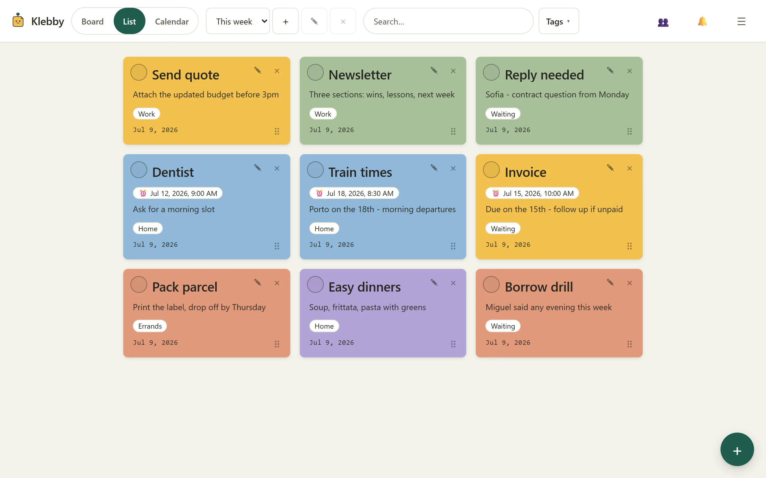
A list records tasks; a board shows the situation
Writing a task down is useful. The problem starts when different tasks become identical lines. “Send the invoice”, “choose a birthday gift”, and “think about the autumn course” may sit next to each other even though one is urgent, one is waiting for a decision, and one is only an idea. The list preserves the words but hides the shape of the work.
A visual to-do list adds another layer: position. Tasks can be separate notes, and their location can mean something. Items near the centre might be active. A cluster on the right might belong to a client. Notes at the bottom might be waiting for someone else. Instead of repeatedly reading every line and reconstructing the context, you can often recognise the state of the work from the layout.
That does not make visual boards universally superior. It makes them useful for work that is messy, mixed, or hard to prioritise in a single order. The real advantage is not decoration. It is giving each task enough visible context to help you decide what to do next.
Why a long list can become invisible
Lists are excellent when order is the information: follow a recipe, pack for a trip, or complete a closing checklist. They become weaker when the items do not belong in one sequence.
Imagine a freelance designer on Monday morning. Their list contains twelve items: revise a logo, chase two invoices, book a dentist appointment, research a new monitor, answer a client question, and develop three early ideas. Sorting all twelve by priority is surprisingly expensive. The order changes whenever an email arrives. Low-effort errands sit beside deep work. Waiting tasks look actionable even when somebody else has the next move.
On a visual board, the same tasks can form three simple areas: “doing”, “next”, and “waiting”. The client question can sit beside the logo revision because they share context. The invoices can stay together. The monitor research can move away from today’s work without being deleted or forgotten. The board makes distinctions that a single vertical sequence cannot show at once.
A clear title also speeds up scanning. “Send May invoice to Rui” is easier to recognise than “Invoice”. Colour and position can add cues, but a vague card remains vague wherever you place it.
Start with three zones, not a perfect system
The easiest visual to-do board has only three zones:
- Now: the small number of tasks you could realistically work on today.
- Next: useful work that is ready but not active yet.
- Waiting: tasks blocked by a person, delivery, decision, or date.
This is deliberately less elaborate than a full project workflow. You do not need seven columns, priority scores, or a colour legend before adding your first task. Put each note where it best describes the current state. When the state changes, move it.
Keep “Now” physically small. If it holds fifteen notes, it no longer answers the question it was meant to answer. Move the excess back to “Next”. This is not pretending the other work does not exist; it is protecting the part of the board that guides immediate action.
Use “Waiting” actively. Write what you are waiting for and, when useful, who owns the next step: “Waiting for Marta to approve the proof”, not merely “Brochure”. A one-shot reminder can bring the note back on Friday if silence needs a follow-up. Until then, it does not have to compete visually with work you can do.
Make every note actionable at a glance
A board cannot rescue unclear tasks. “Website” is a topic. “Draft the pricing-page headline” is an action. “Taxes” is a worry. “Download June receipts” is a next step.
Try to give each note one concrete outcome. If a note contains five separate actions, split it when those actions could move independently. Keep useful context in the body (an address, a short constraint, or the reason the task matters), but let the title remain scannable.
Tags can carry context that position should not. A task might be tagged “home”, “money”, or with a project name. In Klebby, filtering by one tag narrows the working set without rebuilding the board. That is useful when a board contains both personal and work notes, or when you want to see everything connected to one client for ten minutes and then return to the full view.
Colour is best used sparingly. If red always means urgent, it can be a reliable signal. If every project, mood, effort level, and owner has a colour, remembering the system becomes work. Position and plain language should do most of the organising.
Review the board instead of constantly reorganising it
A visual system stays useful through a short review, not continuous polishing. At the start or end of the day, scan the whole board and ask:
- Is anything in “Now” no longer realistic today?
- Has a waiting item become actionable?
- Is there a note I keep moving because the action is unclear?
- Can a finished or irrelevant note leave the active view?
Five deliberate minutes are usually more useful than nudging cards whenever you feel uncertain. A board is a decision aid, not a miniature room that must always look tidy.
Completed work also needs somewhere to go. Mark it done or remove it from the active area. Leaving every finished task visible may feel satisfying for a day, but over time it weakens the contrast between current work and history.
Know when the visual method is the wrong tool
Use a plain list when the order is fixed, the items are homogeneous, or you need maximum density. A grocery list does not always need a freeform canvas. Neither does a five-step deployment checklist. On a small phone screen, a compact list may also be faster than panning around a large layout.
A board can fail when it becomes a storage attic. Too many visible notes create the same problem as an endless list, only spread across more space. Spatial layouts can also invite procrastination through rearranging. If you spend more time choosing colours and aligning cards than completing them, simplify the board or switch views.
Complex projects may need dependencies, recurring workflows, reporting, files, or formal ownership. Klebby is not designed to replace a full project-management suite. It suits the lighter problem: seeing mixed personal or small-team work, keeping context attached to notes, and sharing only the relevant slice.
Use one working set, in the view that fits the moment
Klebby keeps the board and list connected. You can arrange notes freely when spatial context helps, then switch to the compact list when you want a denser scan. Tags help narrow the view, and a tag can be shared with a viewer or editor without exposing all your other notes. Comments stay with shared notes, while one-shot reminders can return a specific task to your attention later.
You do not need to migrate your entire life to test the idea. Start with one real working set: this week’s freelance tasks, a house move, an exam plan, or the preparations for one event. Create the three zones, add only the tasks that matter to that situation, and use the board for several days. The useful test is not whether it looks impressive. It is whether you spend less time rereading and more time knowing what comes next.
You can review the visual sticky-note board features and compare the current Free and Pro options on the pricing page. When you are ready to try the method, create your first visual to-do board in Klebby.
FAQ
What is a visual to-do list?
A visual to-do list shows tasks as separate cards or notes that can be positioned, grouped, tagged, or moved. The layout carries information as well as the words.
How many tasks should be visible at once?
There is no universal number, but the active area should be readable at a glance. If every task is visible and nothing stands out, move later work into a separate area or filter.
Is a visual board always better than a normal list?
No. A list is often better for a fixed sequence, a short checklist, or fast scanning on a small screen. A visual board helps most when grouping, status, or spatial context matters.
Can I use Klebby as both a board and a list?
Yes. Klebby lets you view the same notes on a freeform board or in a compact list, so you can change the view without maintaining two copies of your tasks.